Client: Letnisko Komańcza
Letnisko Komańcza is a heartfelt initiative born from a passion for the Bieszczady Mountains and the simple beauty of nature. This project was created not as a business, but as a personal offering to share the peace and serenity of the region with friends and family who share a love for the natural world.
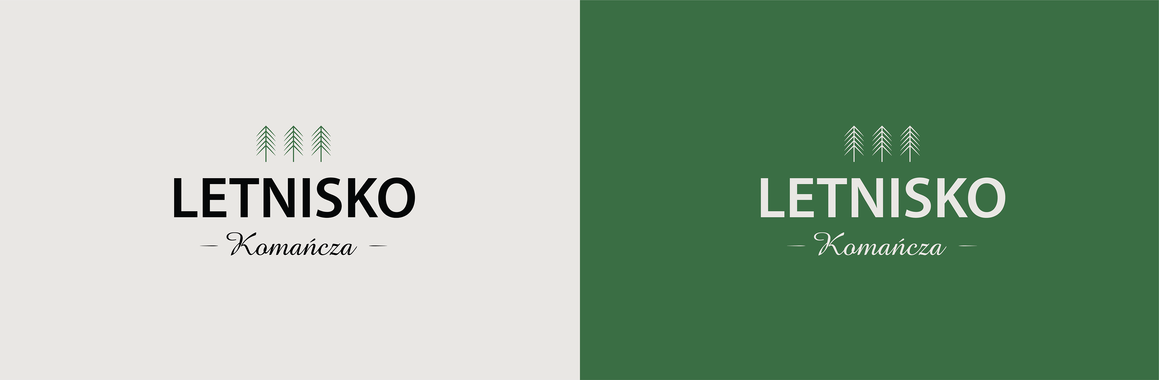
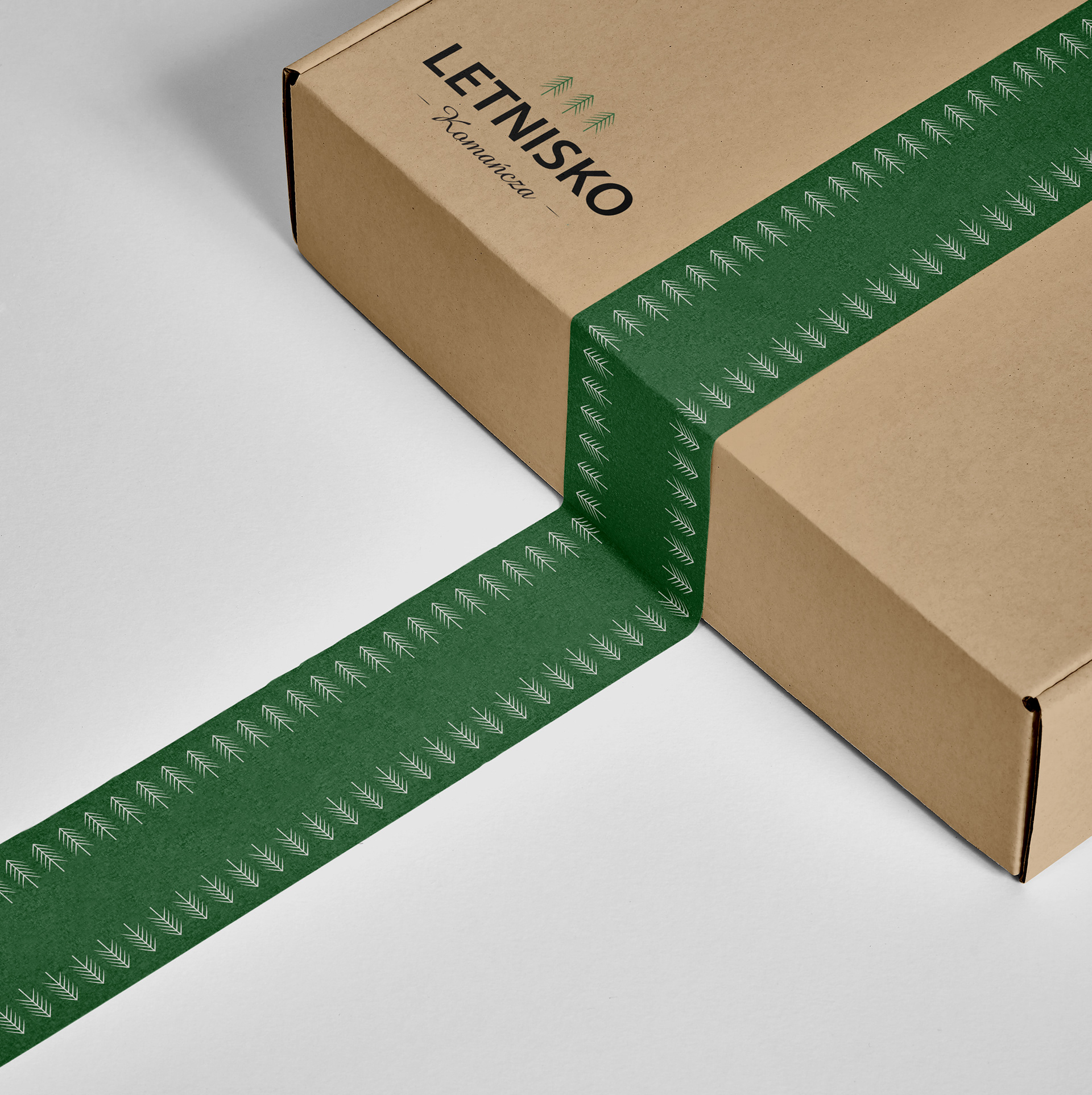
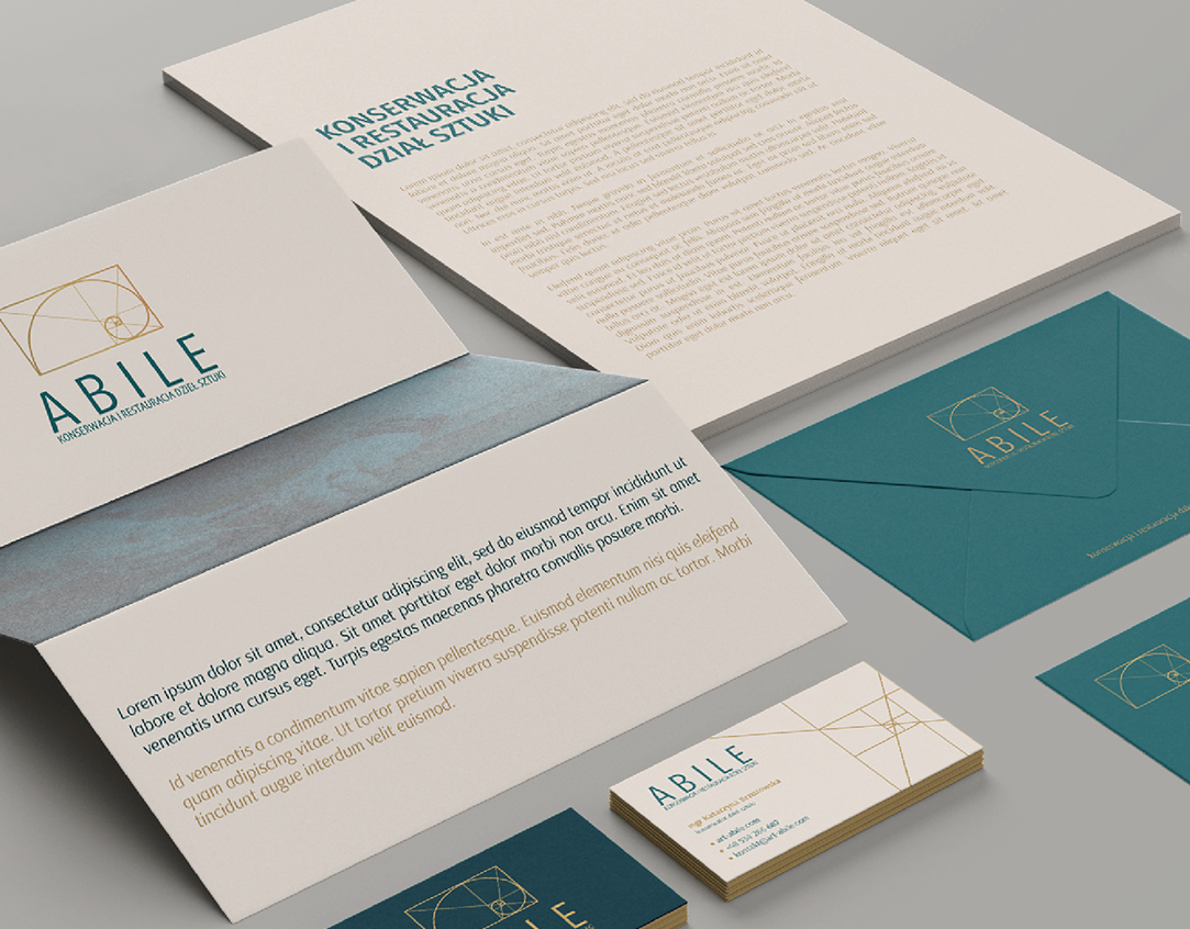
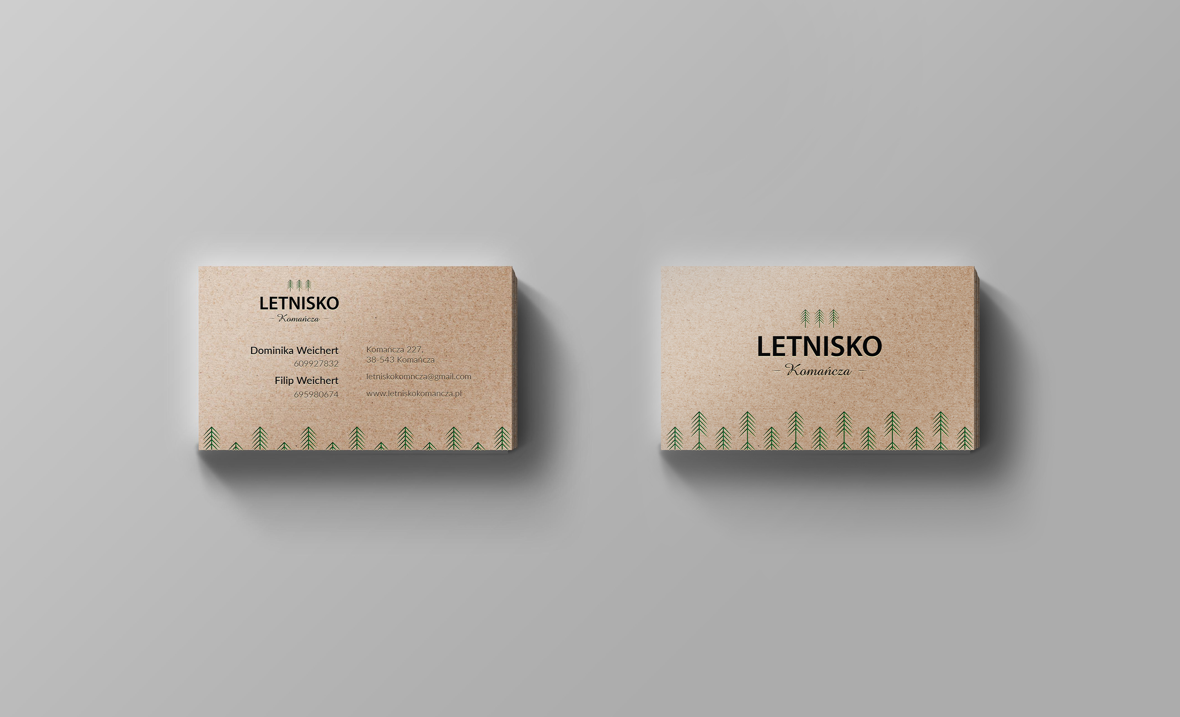
The logo mark, featuring three tall coniferous trees, symbolizes the vast forests that surround the area, a central feature of the Bieszczady landscape. This symbol was carefully incorporated into various design elements, including business cards and a decorative sealing tape, all of which help build a personal and warm identity for the initiative.
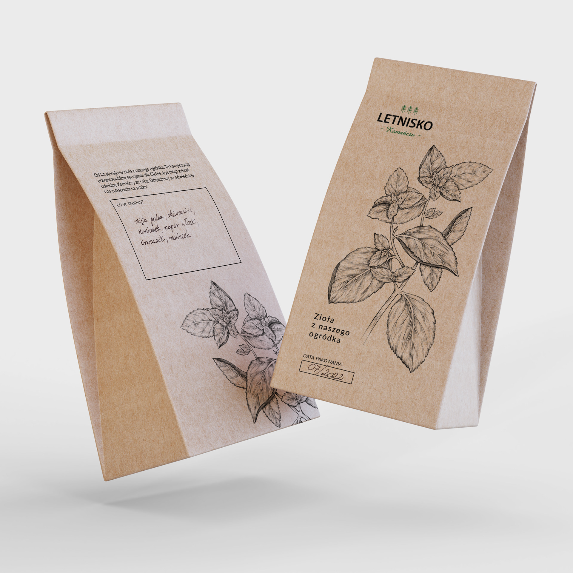
To honor the region’s natural abundance, eco-friendly packaging was designed for herbs grown in a local garden, alongside a custom stamp that evokes the spirit of exploration and sightseeing tourism—perfect for those who want to experience the unspoiled beauty of the Bieszczady mountains.
The color palette chosen for the branding reflects the peaceful and organic nature of the initiative. The primary color draws from the deep greens of the towering coniferous trees, grounding the identity in the region’s lush landscapes. A soft, neutral tone serves as a backdrop, evoking a sense of calm and harmony, while a darker color for text ensures legibility and adds sophistication without overpowering the serene feeling of the overall design.
All materials, from the packaging to the business cards, were printed on eco paper, reinforcing the initiative’s commitment to sustainability and respect for the environment.
This branding package captures the essence of Letnisko Komańcza—a personal initiative created by passionate individuals who want to share the beauty of the Bieszczady Mountains with those closest to them. It’s a place for friends and family to come together, connect with nature, and enjoy the simple joys of life in the mountains.