Client: ABILE
This branding project for ABILE, a company dedicated to the conservation and restoration of works of art and historic objects, reflects their commitment to timeless beauty, precision, and craftsmanship. The logo design incorporates the golden ratio as a central mark, symbolizing harmony, balance, and the meticulous nature of their work.
The color palette was carefully curated to evoke sophistication and elegance. It includes a deep teal representing depth and stability, a muted aqua symbolizing clarity and professionalism, a warm bronze reflecting the richness of heritage, and a soft off-white conveying purity and subtlety. Gold was also integrated for print applications, adding a luxurious and timeless touch, while a gold-imitating gradient was developed for digital use to maintain consistency across mediums.
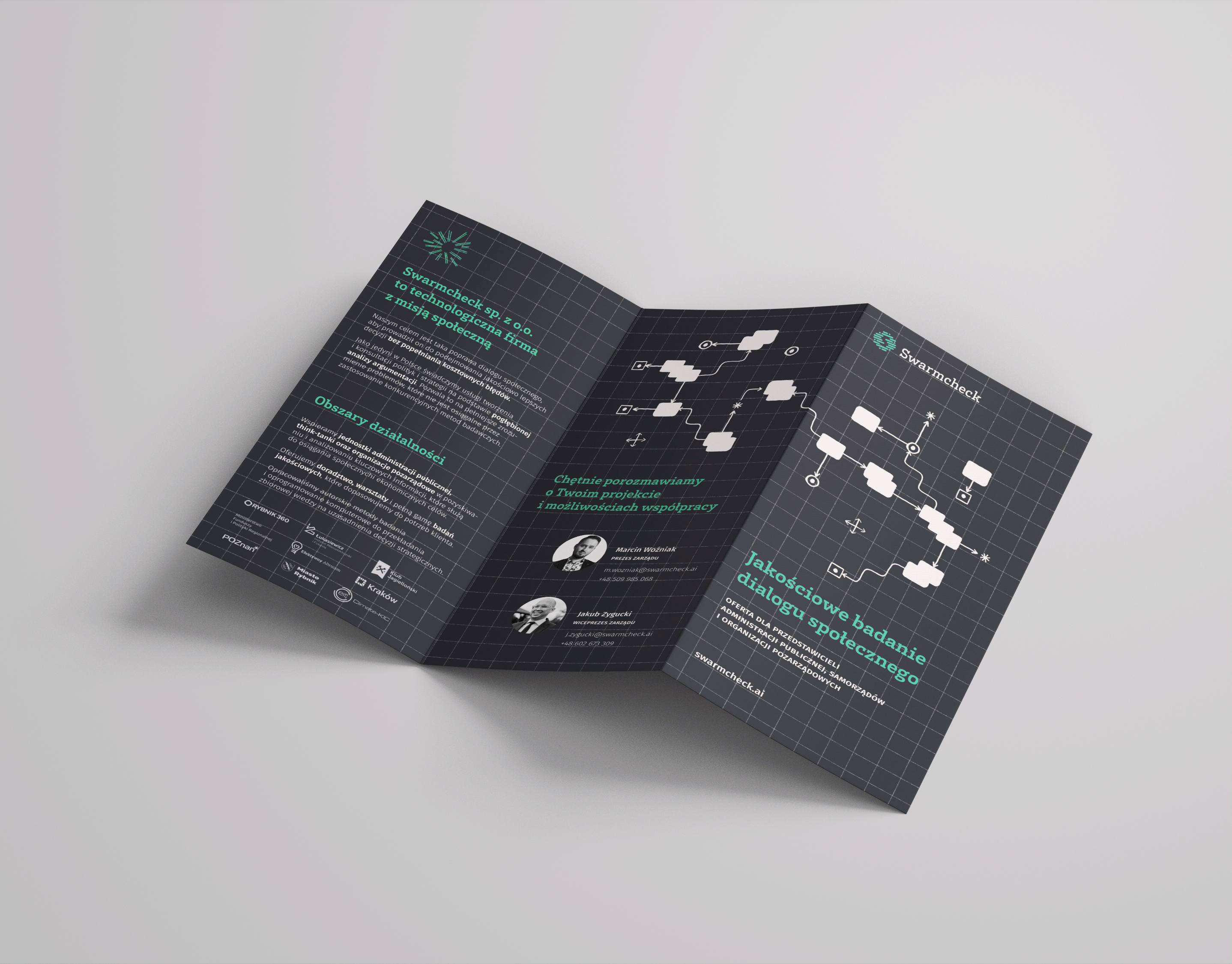
The project encompassed a comprehensive suite of stationery, including business cards, envelopes in the signature muted aqua color, an A4 folded to DL informational pamphlet, and a company letterhead. Each element was designed to ensure a cohesive and professional brand identity, aligning with ABILE’s mission to perfect the art of conservation and restoration.
ABILE specializes in bringing out the timeless beauty of artworks and historic objects, offering a full range of services for the conservation and restoration of paintings, murals, sculptures, and historic artifacts. This branding project captures their dedication to precision, elegance, and the preservation of cultural heritage.
