Organic Jam Labels Yummy in Tummy
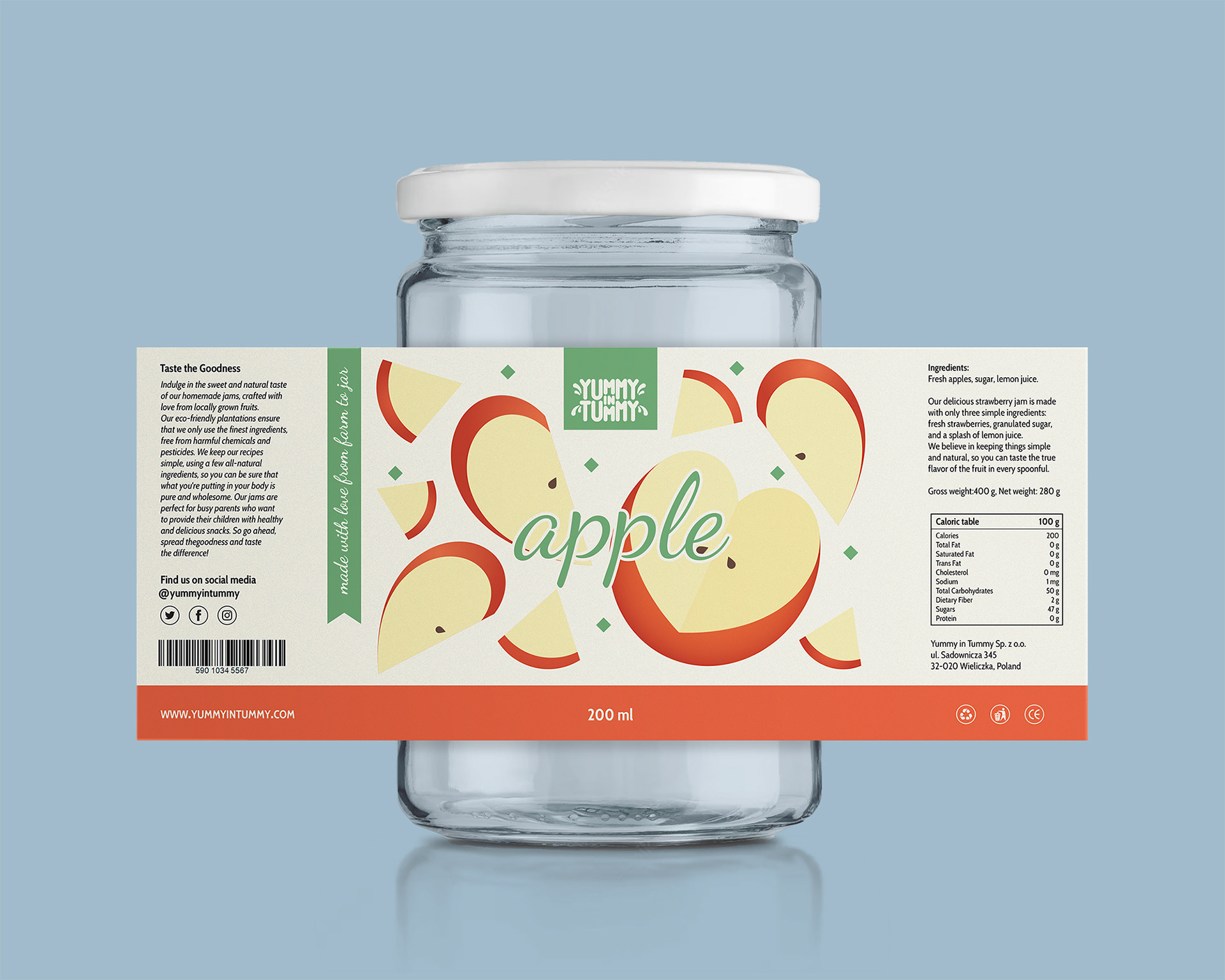
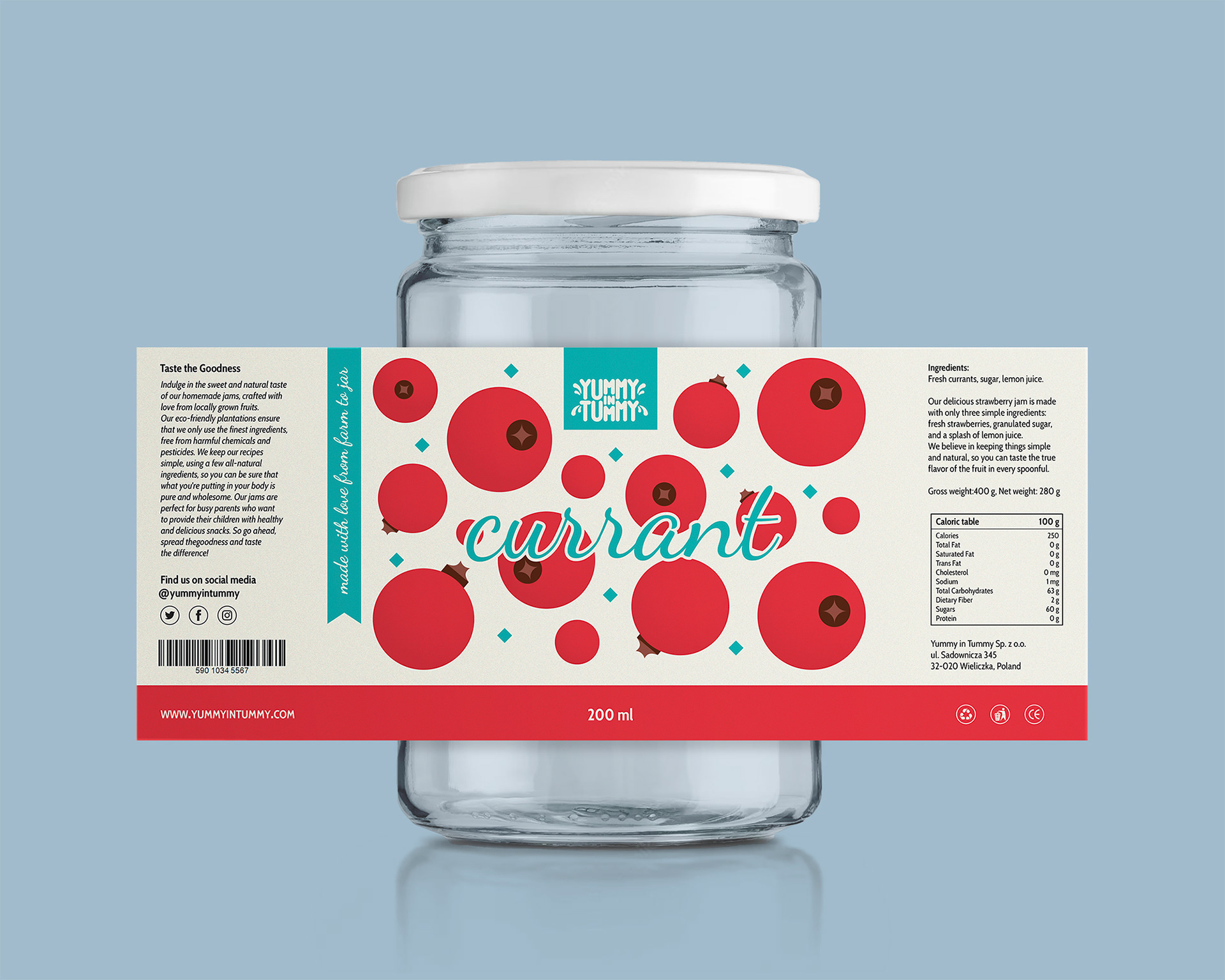
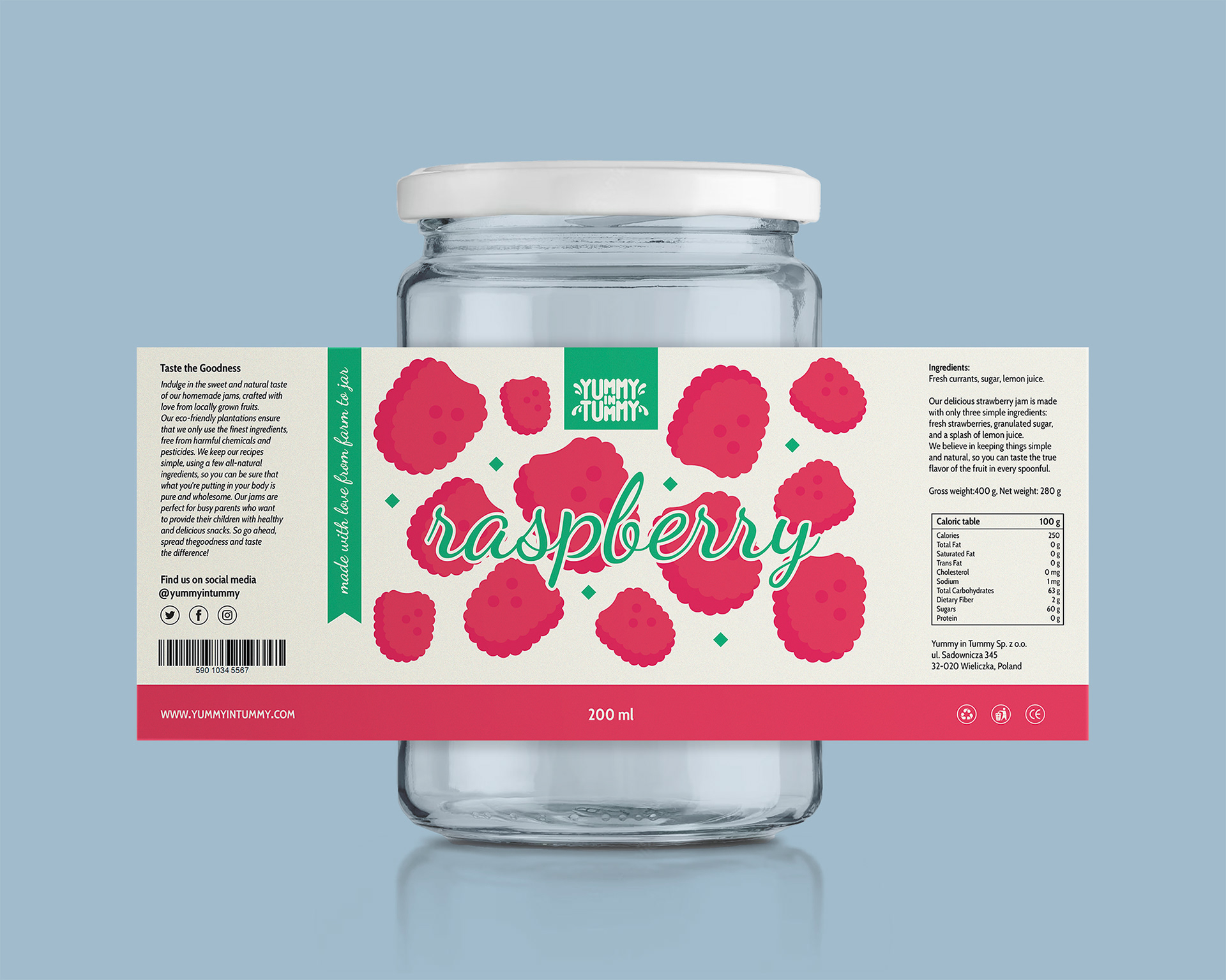
For Yummy in Tummy, a brand dedicated to delivering the natural goodness of homemade jams, a set of vibrant and playful labels was created to reflect the brand’s commitment to simple, high-quality ingredients. The design focuses on creating a connection with customers by highlighting the brand's dedication to locally grown, eco-friendly fruits and natural, chemical-free recipes.
Each jam variety features its own distinct color palette that complements the fruit flavor, with whimsical illustrations of the fruit, creating an approachable and fun visual identity. The playful typeface used for the logo helps communicate the brand’s friendly and inviting nature while maintaining a professional feel.
The labels communicate the essence of the brand’s philosophy through clear, engaging text that emphasizes the purity and simplicity of the jams. The messaging conveys the brand's focus on using only a few all-natural ingredients, allowing the true flavors of the fruit to shine in every jar. By keeping the recipes simple, the jams are positioned as a wholesome option for families looking to provide healthy, tasty snacks.
Each label not only highlights the key ingredients but also includes essential product details—such as calorie information, composition, net weight, a barcode, and social media links—carefully arranged in a way that maintains clarity while complementing the overall design aesthetic.
The combination of playful visuals, clear messaging, and functional details ensures that the packaging isn’t just eye-catching but also communicates the brand’s core values of simplicity, natural ingredients, and a commitment to providing wholesome products for every family.

